INTENTIONAL AESTHETIC. VISUAL VIBES. BRAND ALCHEMY.Well Woman
BRAND GUIDELINES
MAIN HEADING:
Westiga
PARAGRAPH/BODY TEXT:
Aktiv Grotesk
FONTSThis is the main HEADING FONT
Heading 3
Aa Bb Cc Dd Ee Ff Gg Hh Ii Jj Kk Ll Mm Nn Oo Pp Qq Rr Ss Tt Uu Vv Ww Xx Yy Zz
This font selection pairs elegance with modern clarity. Well Woman aims to convey professionalism and reliability, while being a warm and safe landing place for women to walk into — these fonts are giving a sense of softness, and timeless luxury, reminding its readers of an environment of wellness, like a beautiful bath house or the branding on minimal, organic home wares. Westiga evokes her nurturing, cyclical brand story, with curves in all the right places speaking to the fullness of the feminine. Contrasted by Aktiv Grotesk which offers a grounded, clean, and contemporary balance — ensuring accessibility, readability, and practicality when translating complex health information into simple, supportive guidance. Together, this type system communicates Katie’s brand as both approachable and authoritative, soft yet stable and strong.
BUTTONS
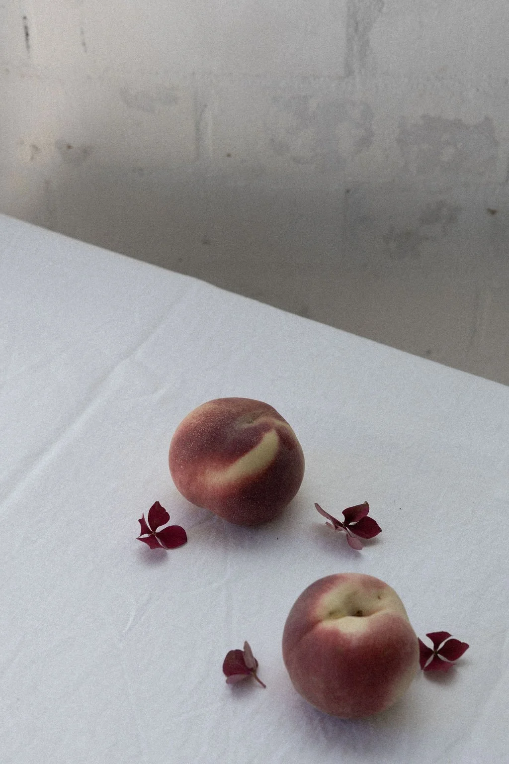
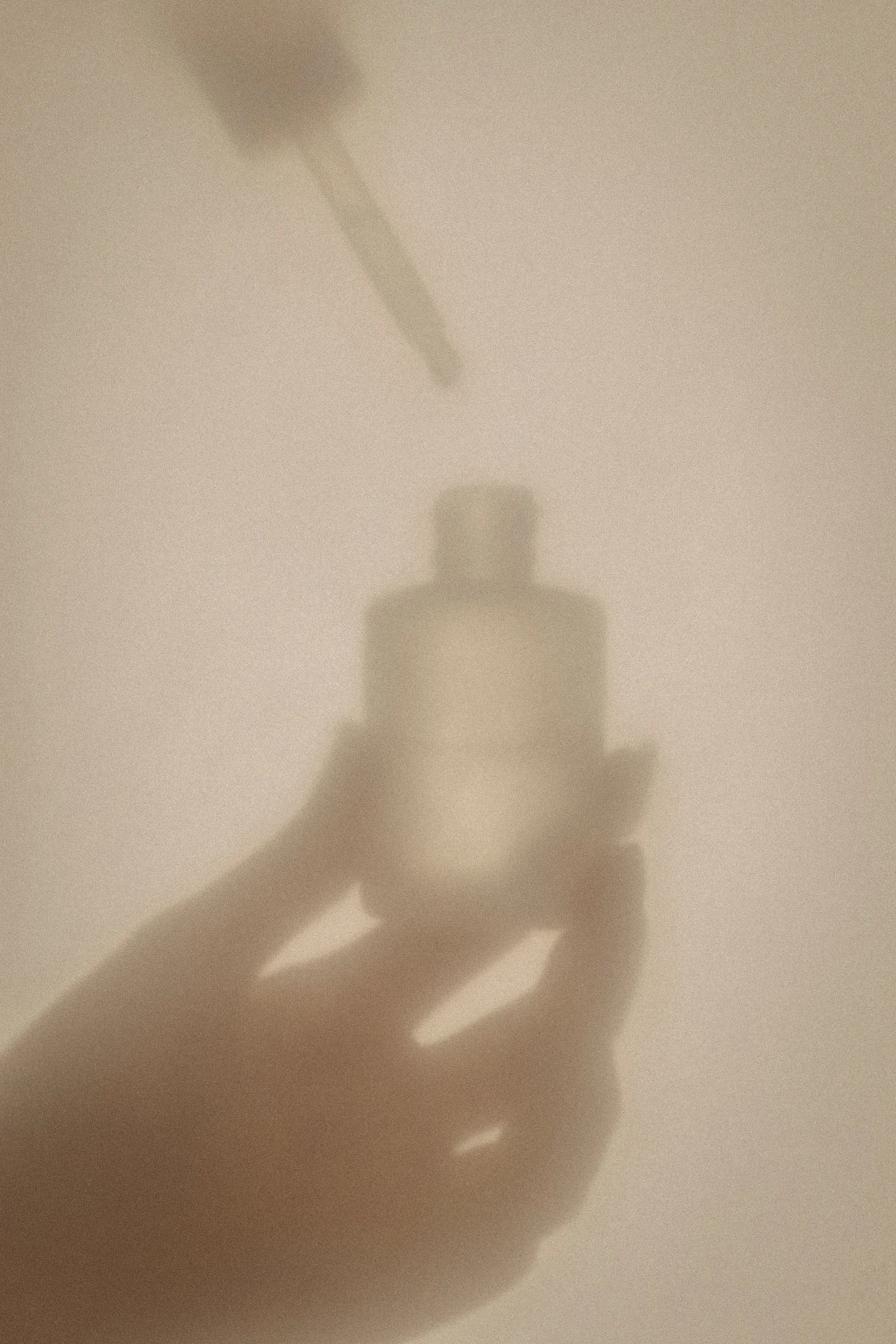
Visual MOOD & IMAGERY inspiration
Brand Goals
BRAND VALUESTrust • Restoration • Empowerment • Nurture • Vitality
BRAND PURPOSE
Well Woman exists to support women in reclaiming their health, vitality, and wholeness. Through naturopathic care, herbal medicine, and cyclical wisdom, Katie empowers women to deeply understand their bodies, balance their hormones, and restore connection to their natural rhythms. Her work is both scientific and soulful — bridging evidence-based practice with embodied knowing.
VISION
To create a world where women feel deeply connected to their bodies and cycles, where healthcare is holistic, preventative, and empowering. A future where women no longer feel dismissed or disempowered by the medical system, but instead have access to knowledge, tools, and care that support their vitality at every stage of life.
MISSION
Katie guides women to take ownership of their health by combining modern naturopathy with ancient feminine wisdom. She offers education, care, and community that help women move from confusion and exhaustion to clarity and confidence. Her mission is to make women feel heard, supported, and equipped with practical tools so they can thrive in their wellbeing and trust in their body’s innate intelligence.
TARGET AUDIENCE
Curious, coachable women who are yearning to feel at home in their bodies — from those navigating fertility, cycles, and contraception naturally, to those seeking nourishment, stability, and a deeper connection with their feminine rhythms. They are health-conscious, spiritually open, and tired of outsourcing authority over their bodies. What they crave is a guide who is both knowledgeable and nurturing, someone who offers grounded wisdom and practical tools while creating a safe, empowering space to reconnect with themselves.
WEBSITE MAIN GOAL
To create a sense of safety and sanctuary, sparking curiosity and trust — so that women feel both deeply seen and inspired to step into support with Katie.
BRAND PROMISE
Every encounter with Well Woman leaves you more grounded, confident, and connected — returning to your body’s wisdom with clarity, ease, and empowerment.
COLOUR PALETTE
Colour Psychology & Associations
This is a brand of vitality, balance, and deep feminine wisdom — a remembrance of the body’s innate intelligence and the natural cycles that guide it.
The colour palette of Well Woman reflects nourishment, clarity, and grounded earthiness, while also evoking the radiance and joy of a woman in full bloom — vibrant, whole, and connected to the rhythms of life.
Both light neutral shades, Pure Quartz and Bone, conveys a sense of understated sophistication. There’s a breath of relief with the minimalism and breathing space that these colours give, a blank canvas of potential and sense of lightness for its viewers to exhale into. These colours symbolise a return to innocence, purification and tapping into the field of possibility — a fresh slate.
Flesh brings a humanness to the palette — conveying incarnation, being IN the body. A blending of brown and white, this is the marriage of earth and heaven, purity and depth, giving a sense of spacious renewal and calm.
The selected shades of purple/lilac — traditionally associated with spiritual pursuit, intuition, healing, connection to something “more” than what is obvious… Winterberry offers luxury and depth, groundedness, the protection of amethyst and the ritual of Wine. There is riches in Winterberry, balanced with the tenderness and subtle mystery of Moon Dust.
Finally, Rose brings a feminine and romantic feel, typically a colour of the heart, of our emotional landscape. This colour brings grace, compassion and connection.
AND ATOLOGY
-
Physical body
Appearance + style
Personality + character
Truth illumination
What people notice about you
The “face” you put on
Your motivation for living life
Outward emanation
Your rising sign broadcasts your medicine for you quite naturally. It is likely what people have reflected back to you as qualities they receive from being around you. This is the role you came to play.
Sensual. Embodied. Earthy. Stable. Luxurious. Opulent. Wealth. Fertility. Abundance. Being a grounding force. Pleasure. Embodiment. Wealth, luxury, opulence. Speaking to audience's sensations and desires. Singing. Speaking beauty. -
-
Safety. Sanctuary. Home. Nest. Divine Femme. Mother. Nourishment. Nurturer.
Mercury CODES
YOUR COMMUNICATION PLACEMENT
Ruler of communication
Articulation
How you share yourself
Speaking
Copywriting
Mindset + perception
Learning style
The Mercury placement gives us valuable information about how you are already wired to express and communicate, and the most align way to share your unique message. These are your gifts of communication and articulation, so that your dream clients can really receive you.
Leverage this code in your content creation for your aligned audience to resonate with you and disrupt any outdated paradigm marketing + sales tactics that don't feel good for you.
Venus AESTHETIC
YOUR MAGNETISM PLACEMENT
Where you’re charmed or lucky
Most ease in manifesting
How you connect with others
Attraction + desire
Beauty + aesthetic
Ease in sales
Receptivity
Your Venus reveals where and how you are most magnetic, and your most exalted state of attraction. This speaks to the environments and energies that align you to your receptive mode and what people love to pay you for.
Working with your Venus brand code increases magnetism, so it is what we focus on most for visual identity, aesthetic and "vibe" to exude.
Brand Tone & Voice
Playful, inquisitive and curious: Gemini energy is dynamic, playful and youthful. Your words should bring life, and feel life-giving as you speak or share them.
Approachable and conversational: trust-building is crucial, and your warmth can disarm people and make your work feel like an accessible no-brainer as they feel safe with you.
Nurturing and reassuring: Cancer energy is the divine mother, there is a maturation and sense of comfort you provide, however Love is not wishy washy. Don’t confuse this nurturing element with being overly soft… sometimes kindness is concise and clear.
HOW TO USE THIS IN YOUR CONTENT —
Imagine speaking to ONE person when you address your audience, rather than them as a whole… like you’re on Facetime with a friend ie instead of “hey guys!” speak to your IDEAL CLIENT and their heart.
Break down complex scientific or information chunks into simplicity and using lots of sensory language
If you are called to speak — practice, practice, practice and let them hear your voice!! More so than writing, having your people HEAR you gives you a direct line to the immense value you have to offer and your brand environment
Connect to the senses, share beauty and create associations with your brand elements like flowers, water (Cancer is a water element!), small steps toward a goal (Capricorn), wear pinks and lavender, strengthen these associations to contribute to your brand aesthetic

Sacred. Nurturing. Restorative: this is Well Woman
BRAND GUIDELINES